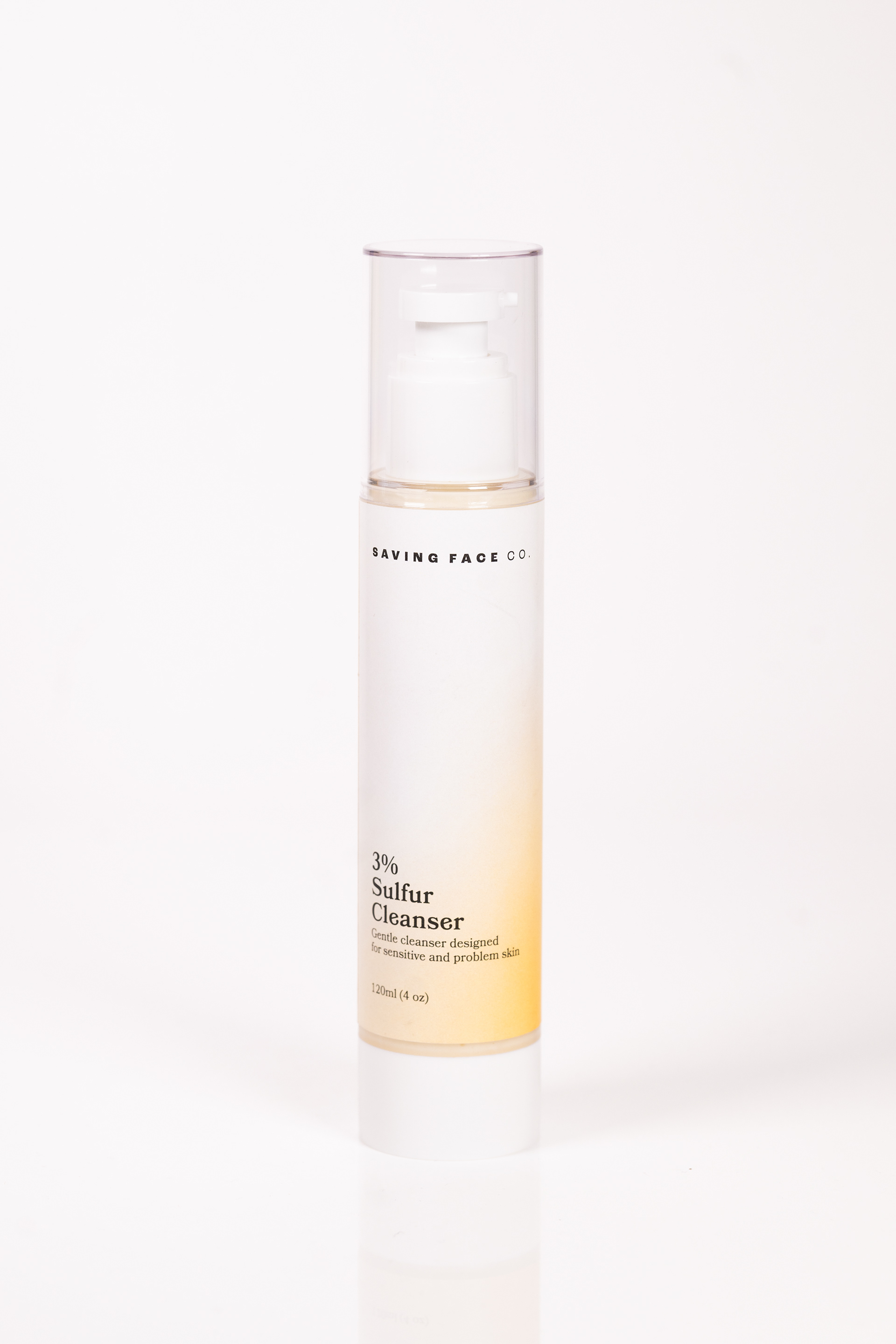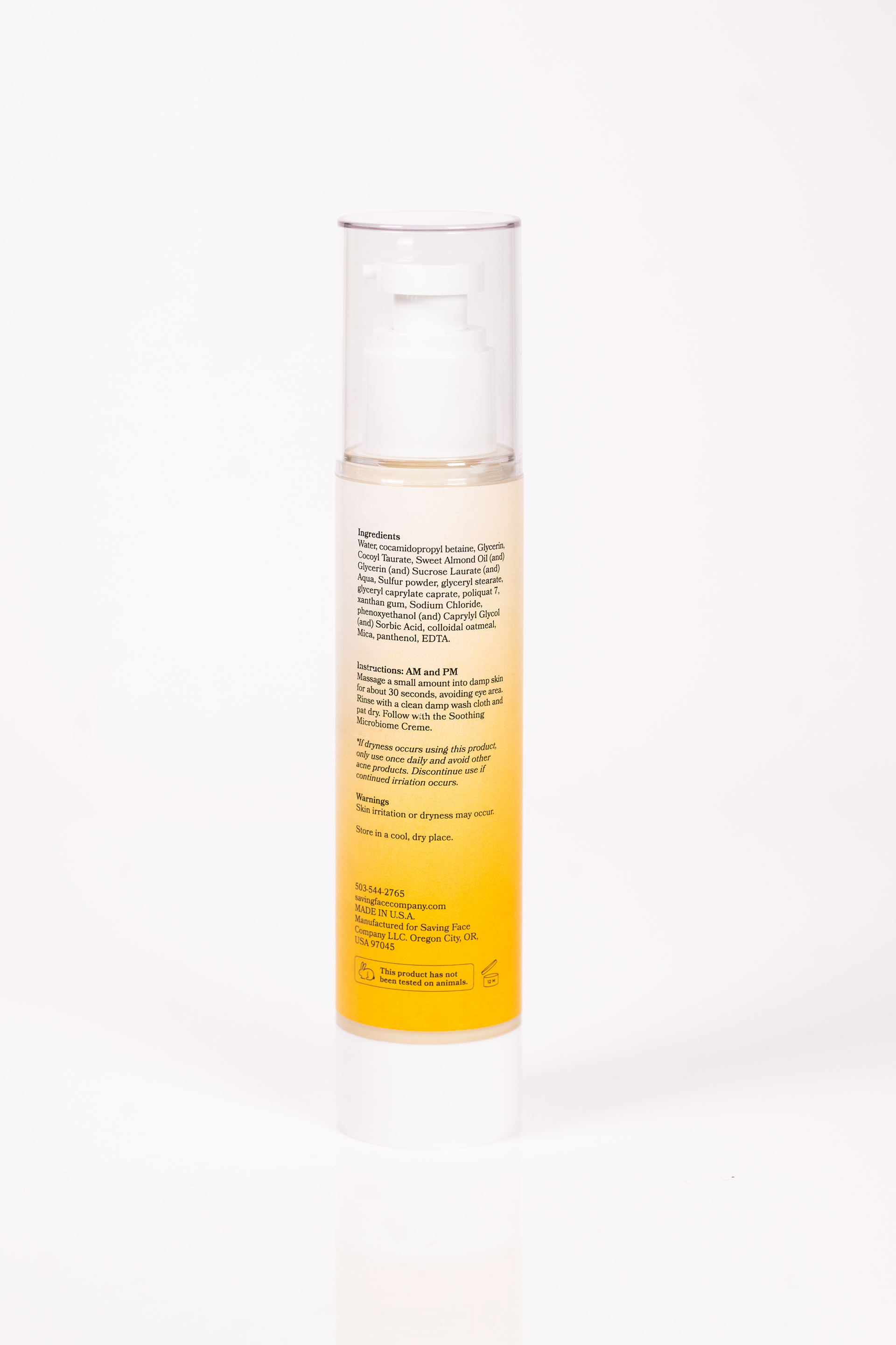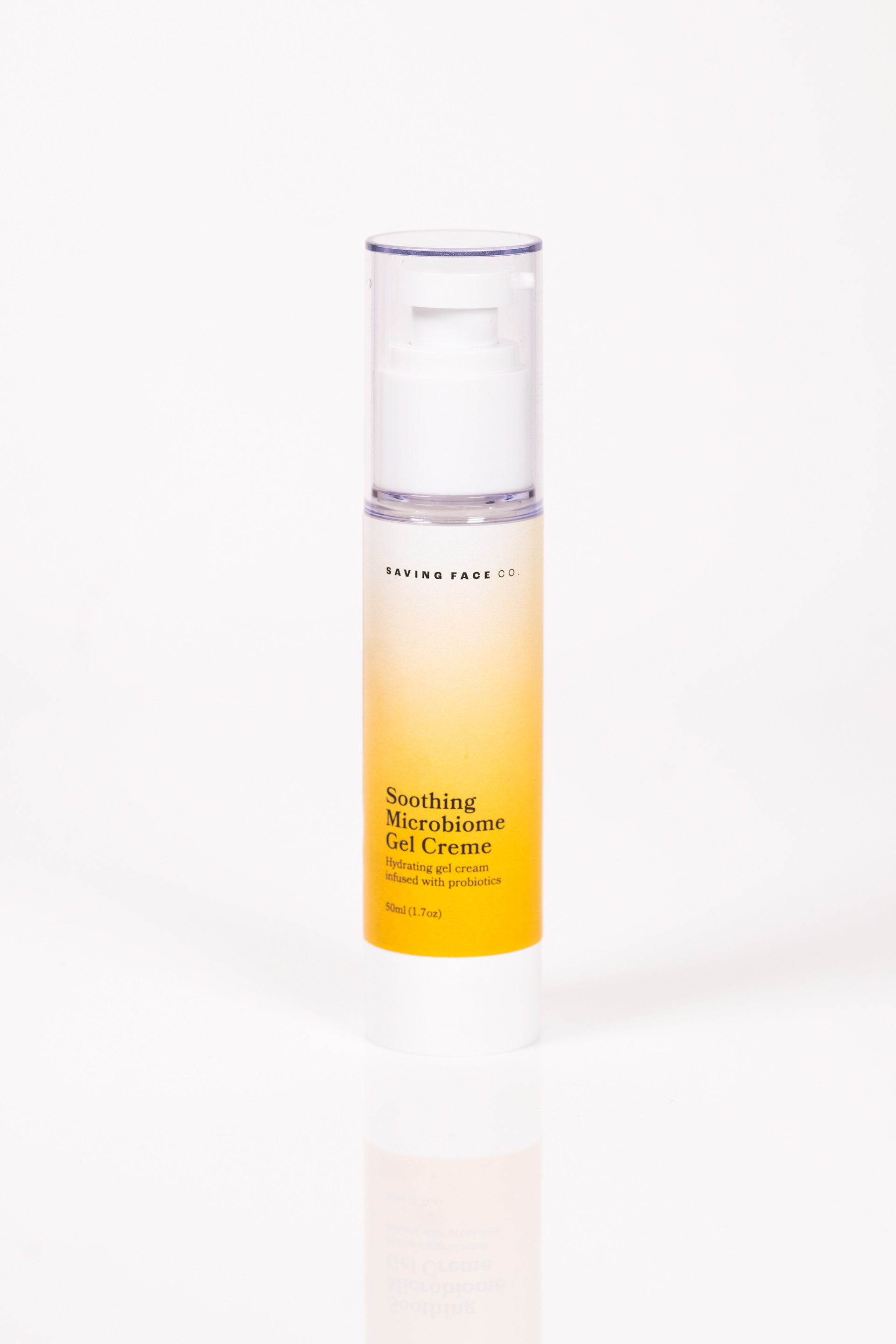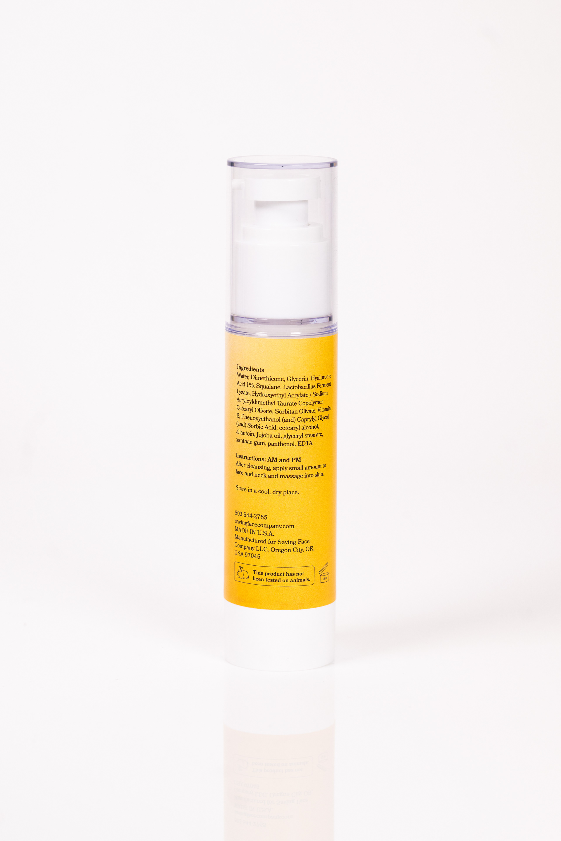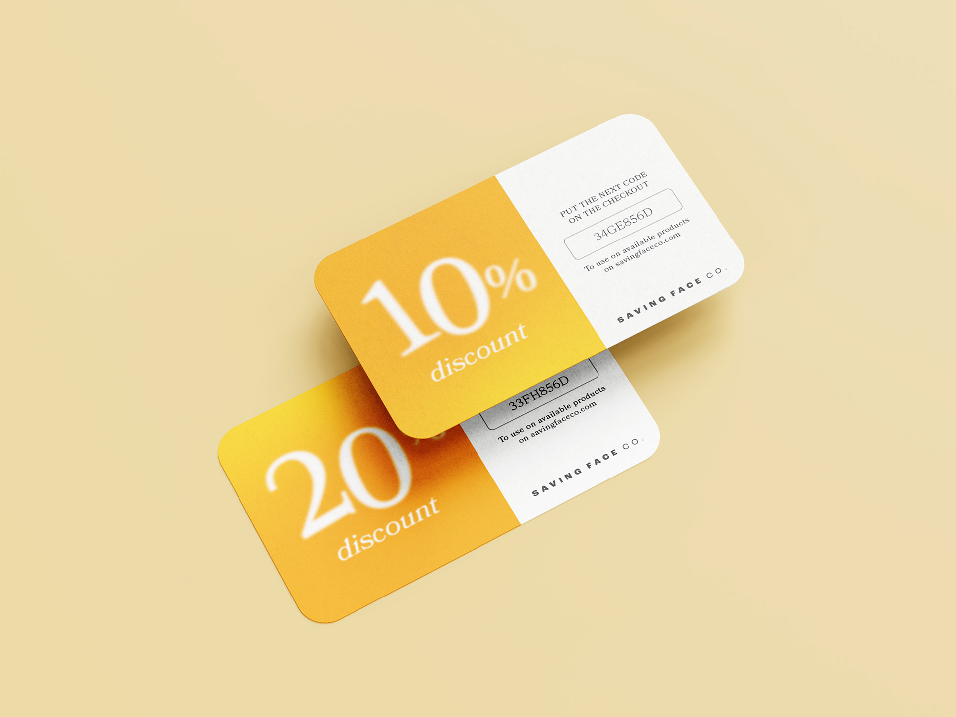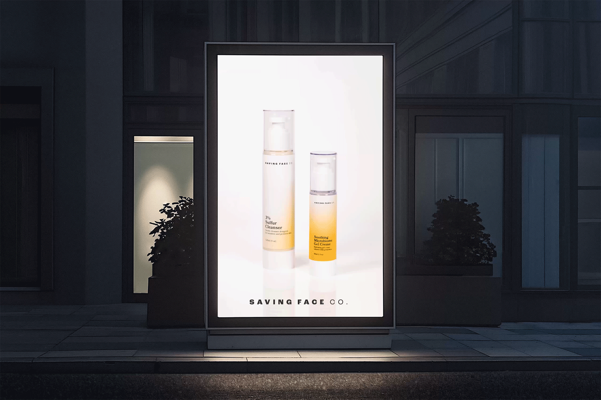

Saving Face Co.
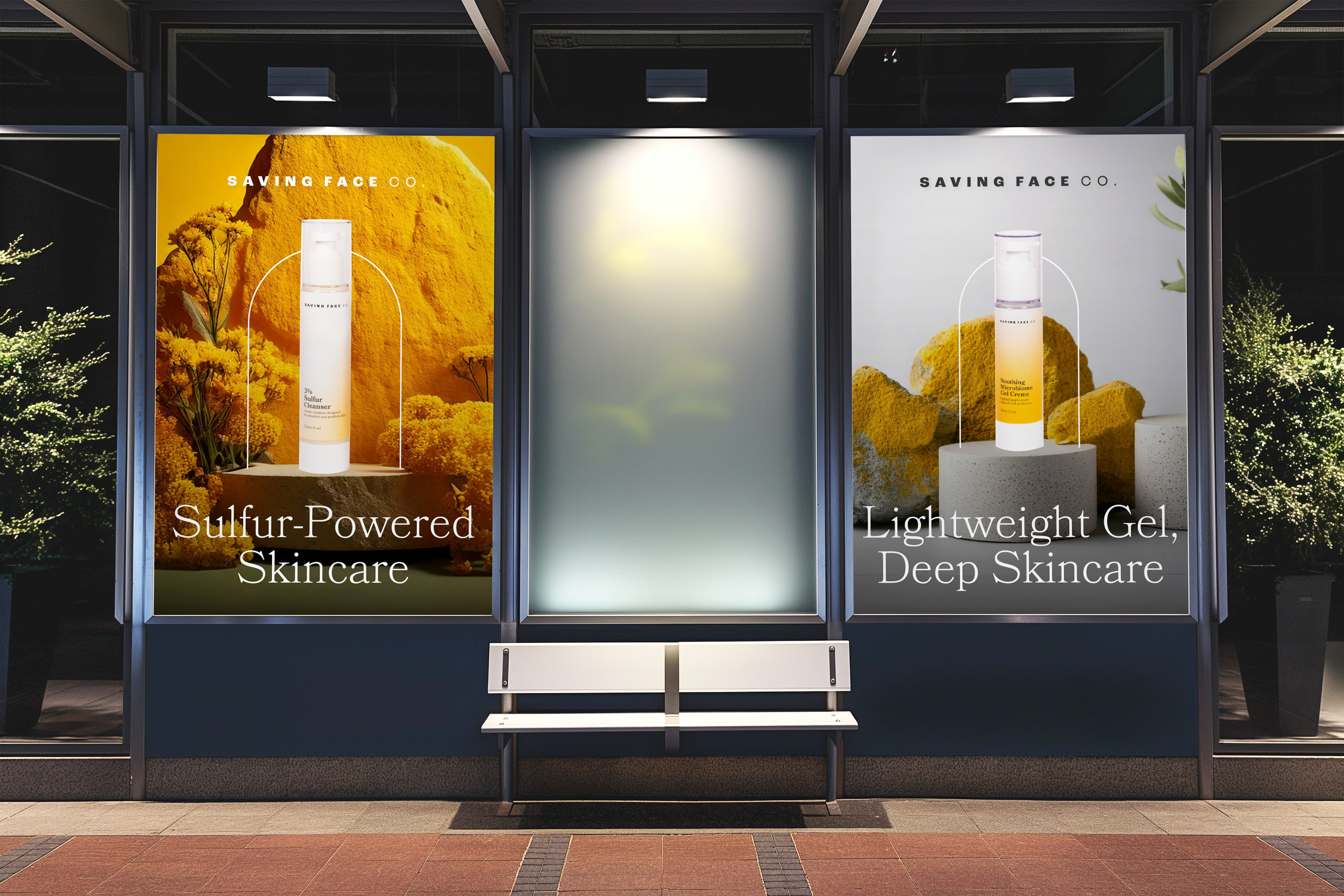
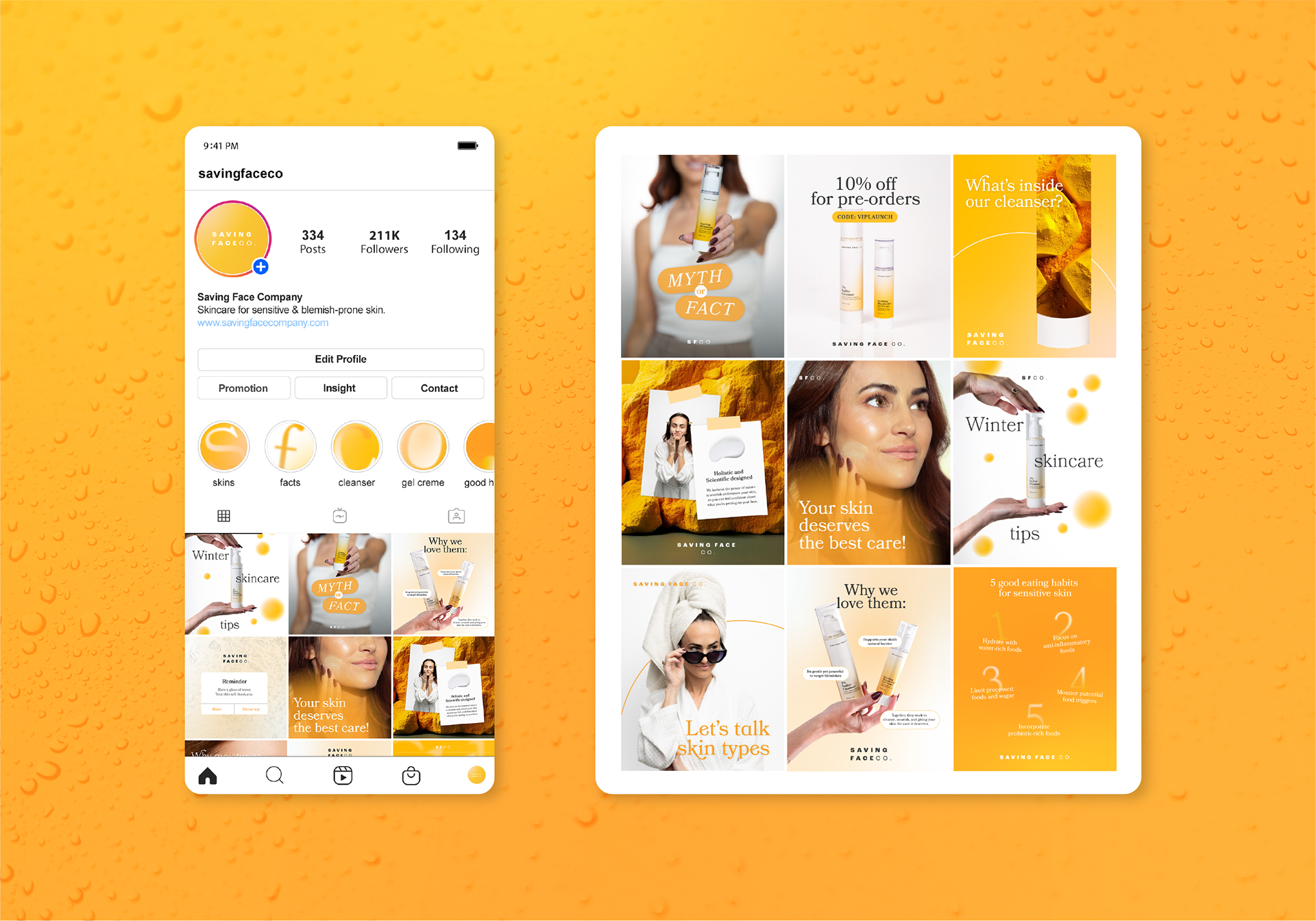
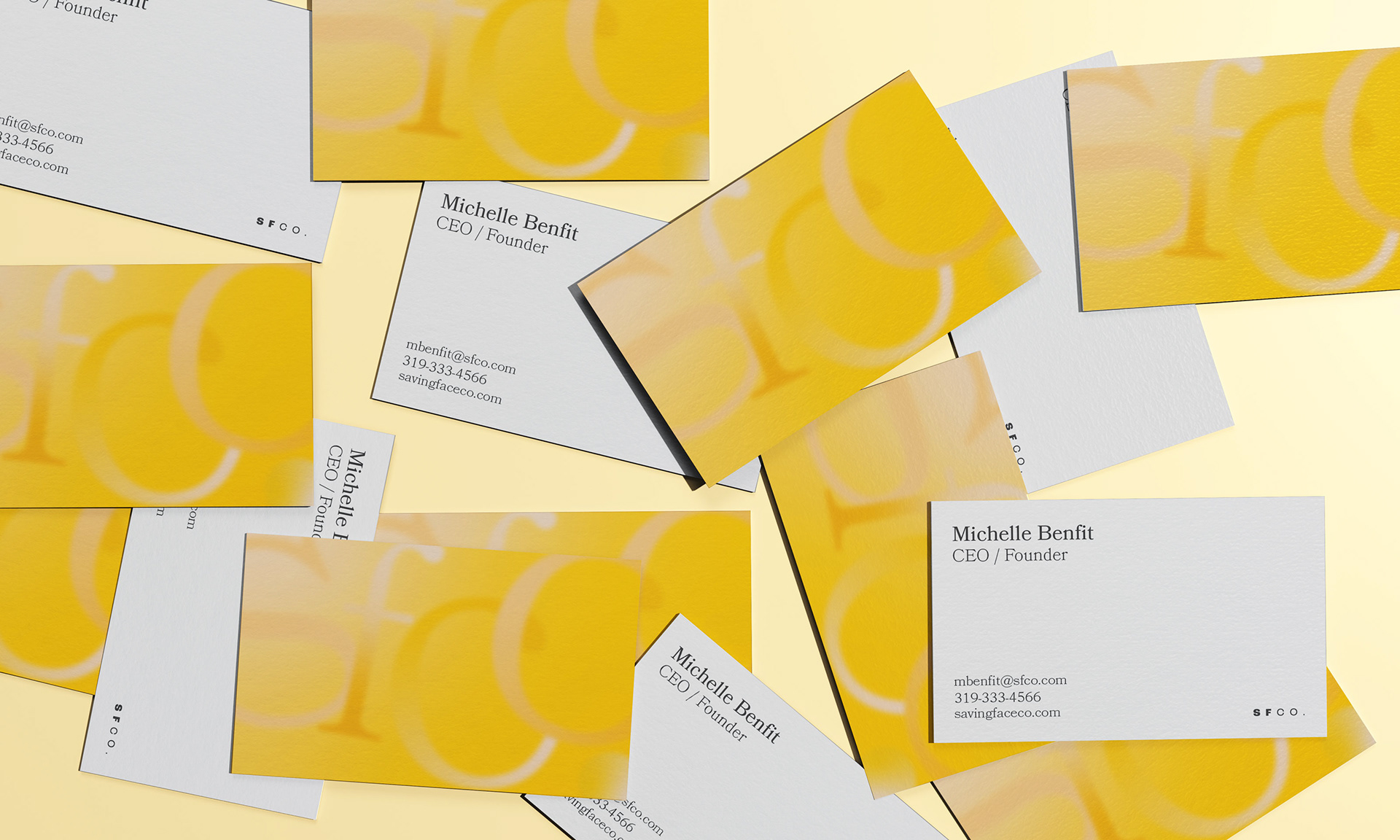
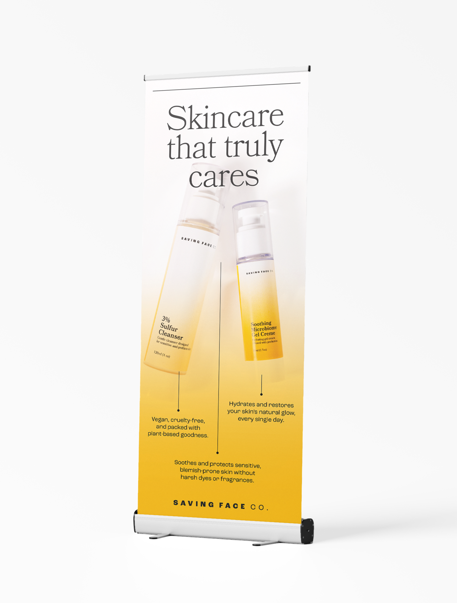
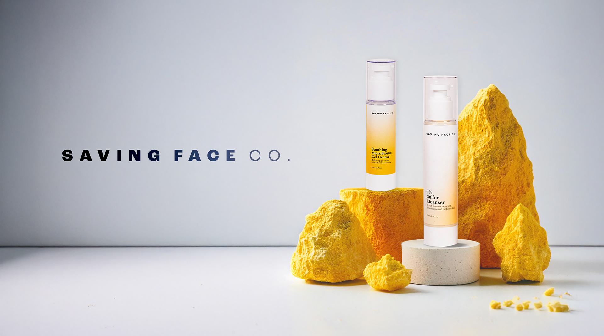
This design development centers on a modern, vibrant, and minimal aesthetic to reflect the innovation and efficacy of its products: a sulfur-based cleanser and a microbiome gel. The logo features a minimalist and modern font, emphasizing clarity and elegance while the corporate font adds to a delicate and feminine style. The bright yellow and orange hues symbolize energy, renewal, and the power of their active ingredients, while the dark grey and white provide a clean, sophisticated balance. Art direction captures a harmonious blend of science and nature, focusing on clean lines and airy compositions. Packaging labels incorporate the brand's color palette with subtle gradients, emphasizing product details with fine typography. Social media mirror this cohesive style, combining striking visuals with educational content, ensuring a seamless brand identity across platforms. Photos by Kelly Mooney Photography.
Services: #BRANDDESIGN #BRANDDEVELOPMENT #ARTDIRECTION #PACKAGINGDESIGN